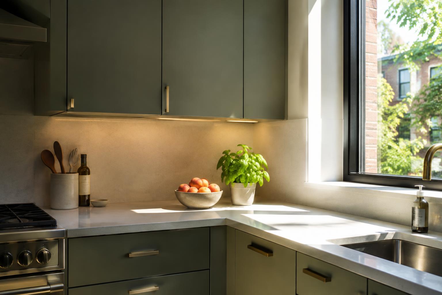
Choosing Kitchen Finishes for a Small DC Space: Light Without Glare
Late summer is a moment between vacations and the school year, a good time to look at the house with fresh eyes before autumn routines return.
A small Washington condo kitchen can feel bright without relying on highly polished surfaces or an all-white palette. The goal is comfortable visibility and a clear sense of the room, not the greatest possible number of reflections. Start with the actual light: where daylight enters, which surfaces remain shaded and what electric lighting will be used after dark. Finish choices should respond to those conditions rather than imitate a photograph taken in a different setting.
Identify the kitchen's main viewpoints, including the sofa or dining table if the room is open to the living area. A countertop that looks calm when viewed from above may reflect a pendant directly toward someone seated nearby. A backsplash may appear subtle in a sample but become visually active across a full wall. Evaluate the room as a set of connected views, not as a collection of individually appealing products.
01Separate Color From Reflectivity
A pale surface and a glossy surface are not the same design decision. Light-colored cabinetry can provide a bright visual field with a quieter sheen, while a darker accent may add definition without making the whole room feel heavy. Compare finishes in the same color family with different surface qualities. This helps reveal whether the desired effect comes from color, reflection or contrast, and prevents gloss from becoming the automatic answer to limited daylight.
Use contrast to clarify important relationships. The countertop should be readable against the cabinet fronts, and handles should make sense on the chosen finish. Too little variation can flatten the room; too many competing contrasts can fragment it. Select one dominant background and a small number of supporting elements. A narrow kitchen often benefits from visual continuity, but continuity does not require every material to be identical in color or texture.
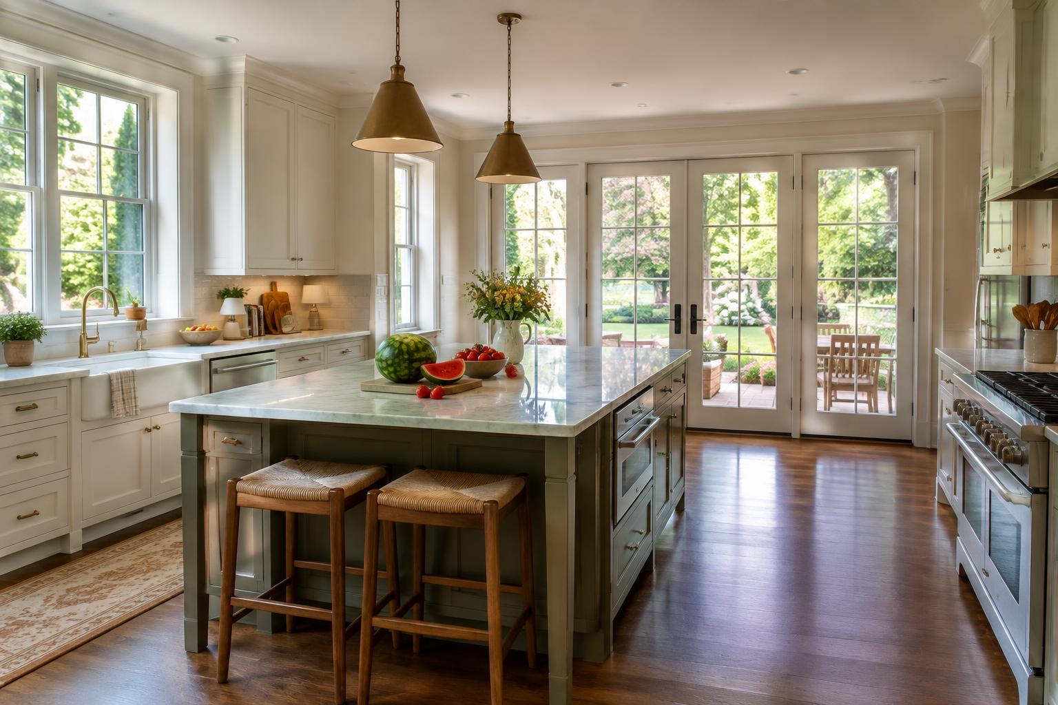
02Choose the Countertop From Real Samples
Evaluate a sample large enough to understand pattern, not just a small chip showing the background color. Ask how the material's variation will appear across the actual countertop pieces and seams. Strong movement can be beautiful, but it should relate to the scale of the room and the backsplash. When every short counter segment displays a different dramatic fragment, the result may feel busier than the original sample suggested.
Compare the sample under daylight and planned task lighting. View it while standing at the counter and while seated in the adjoining room. Discuss care and performance using the supplier's information for the exact material rather than broad promises that a category is maintenance-free or indestructible. A finish that suits the household's cleaning habits is more valuable than one selected solely because it appears luminous in a showroom.
03Keep the Backsplash From Becoming a Light Show
Backsplashes sit directly in the path of many undercabinet fixtures, making sheen, texture and installation detail especially visible. A reflective tile can reveal individual light points or create a bright band at eye level. A pronounced texture can produce shadows that are attractive in one setting and distracting in another. Mock up the proposed tile beneath representative lighting before ordering enough for the room.
Coordinate grout, joints, outlets and termination points as part of the design. A quiet tile can become visually busy when interrupted by contrasting grout and scattered devices. Conversely, a deliberate joint pattern may provide useful detail in an otherwise restrained kitchen. Decide where the backsplash ends and how it meets a window, cabinet side or exposed wall. Small rooms offer fewer places to hide unresolved edges, so these decisions deserve attention early.
04Coordinate Cabinetry, Hardware and Fixtures
Cabinet fronts form a large part of the kitchen's visual field. Compare their sheen alongside the countertop rather than choosing each separately. A lightly textured or lower-sheen surface may soften reflections, but assess its care instructions and appearance with actual fingerprints and routine handling in mind. If two cabinet colors are proposed, use them to organize the room rather than divide a short run into unrelated blocks.
Treat metallic elements as accents with visible behavior under light. Hardware, a faucet and decorative fixtures need not match perfectly, but their differences should feel intentional. Highly reflective pieces can introduce bright points even in an otherwise matte room. Check handle projection and comfort as well as appearance. A visually restrained kitchen still needs fittings that are easy to grasp and do not create avoidable conflicts at corners or beside appliances.
Test color, sheen and lighting together in the actual condo so the kitchen feels bright without producing distracting reflections.THE SAROKEY APPROACH
05Approve a Complete Light-and-Material Mockup
Bring the principal samples together in the condo: cabinet finish, countertop, backsplash, flooring and metal finish. Stand them in approximately their installed orientations instead of laying everything flat on a table. Review the combination in morning, evening and electric light. Ask the designer to show fixture locations and undercabinet details alongside the finish board. The same materials can produce very different results under a broad wash of light or a series of exposed bright points.
If the update includes wiring, lighting relocation or broader kitchen alterations, confirm the scope through DC DOB's alteration and repair guidance. Finish selection should remain coordinated with installation rather than outrunning it. Approve the palette when it provides comfortable work surfaces, coherent views and manageable maintenance. A successful small kitchen does not need to sparkle from every angle; it needs to feel clear and welcoming throughout the day.